There’s an interesting article discussing book covers in a digital age over on The Literary Platform, sparked by the release of the Odyssey Editions ebooks from the likes of Amis, Bellow, Nabokov, Rushdie et al which also triggered an apoplectic response from said writers’ publisher, Random House. While it will be interesting to see the outcome of the dispute between Random House and Odyssey over the ebook rights to some of the biggest names in literature, it was the covers of the titles that really caught my eye.

In the Literary Platform article they explore the relevance of book covers to digital copies and argue that ‘cover art only sells physical books.’ The fact that many of these covers are reduced to low res images on various book/ebook stores helps support this. I certainly can’t think of any book I have ordered from amazon because the cover appealed, which does happen in a bricks and mortar store, and it pains me to see book covers reduced to grainy black and white on my ereader screen.
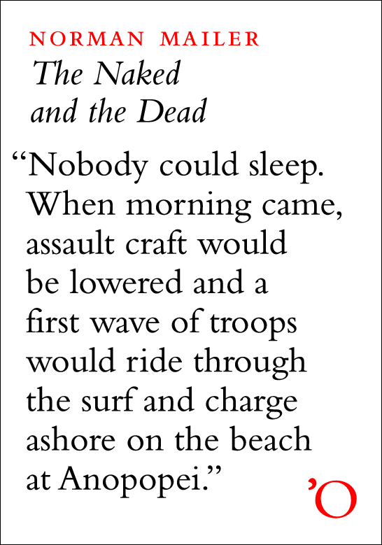
Odyssey’s answer is to make the covers typographic, with the story opening on the cover. As The Literary Platfrom explains, these covers are then ‘not covers in any traditional sense: they have nothing to cover. They are icons. Signifiers. And more crucially, they’re not there to sell the book directly; they are marketing material separated from the point-of-sale.’ Certainly for ebooks these work well and I am sure will look a damn sight better on an e-Ink screen that more conventional covers.
The whole thing certainly gives me food for thought regarding possible covers for any ebooks I might decide to produce via Smashwords or some similar site.
How about you? Do ebooks need covers at all?

9 Responses to Judging a digital book by its digital cover
I still judge an ebook by its cover, even if the only time I ever see it is on the Amazon site. It implies that the author cared enough about the book to dress it.
To me, no cover says, ‘amateur.’
That’s a good point and one I know many will agree with. Do text covers not count as proper covers? Salinger famously wouldn’t have any images on his book covers. And Cormac McCarthy’s books look so much better with the large font titles than the movie tie-in images. Are words more ‘amateur’ on book covers than images?
Boy, that’s tough. I think that for writers it’s a completely different answer than for a non-writer. I shy away from a book that has the movie screen shot on the cover. Was the book written from the movie or the movie created from the book? As a writer, I wouldn’t want Brad Pitt’s face on the cover of a book I wrote (yeah, like that’s ever going to happen). The average book buyer might feel differently.
To Laura’s point, though, how often does the author have input into the cover design if it’s published by a traditional publisher? My guess? Not very often. In self-publishing that equation changes. In e-publishing, I still like the idea of a cover but I’m not sure it translates well. I’ve thought about this, too, since I have a working manuscript that may go to Smashwords. The cover art is done but would it work as a little icon? Don’t know. Amazon size? Yes, it would make a difference, in my opinion.
Size is a key issue addressed in The Literary Platform’s article. They question the usefulness of low res images that proliferate on online stores (even Amazon).
Your point about most readers not being bothered about movie tie-in covers is one I totally agree with. They serve a purpose in that they get people reading books they might otherwise have missed. Can’t say I would complain if a cover I didn’t personally like helped sell loads of copies of something I had written.
That said, there is something about the simplicity of a text only cover that appeals to me. It does away with any interference the cover image might cause between book and reader. I can think of loads of books that are beautifully designed but have only words on the cover. Perhaps that’s another post right there.
Huge thanks to you, Susan, and to Laura for taking the time to comment.
Ooh that’s a good question. I like the idea of putting a line from the book on the cover, and if you knew your typography that could look stunning, but at the same time, you’re still attempting to sum up a story in one line, which could be just as misleading as using an image. I think you still need a cover, even as a thumbnail, in order for it to stand out. Imagine going on Smashwords or whatever and just seeing page after page of titles. It’d drive you mad. I don’t think the covers have to be quite as ‘graphic’ as they’d be for an actual book, but I think some sort of image, just to give the brain something to respond to, is still a good idea.
Hmm. I have to say, I always notice the covers of the ebooks I buy (which are usually the standard publisher’s cover plus the title and author) but since I read my ebooks on an ereader with the eink, I wouldn’t want a full-colour cover because it wouldn’t look right anyway. That said, I always look at the covers while I browse for books on the sites where I buy my ebooks, and I judge the covers there.
So, I think ebooks should be linked with their physical covers, and if there is not physical cover they should have at least a graphic that sets them apart. I think the text one that you mention would be fine for me. I’d rather the promotion money went to sending the author around to signings and talks than a nifty cover, I guess.
Creating a catchy cover, Jen, can be simpler and less expensive than you think. On the other hand, as Icy said, the cover can be misleading whether it’s a line of text or a photo/graphic that may mislead the reader. When I read a novel I like to imagine the characters in my mind. The cover should not have people unless it’s non-fiction. Scenery, maybe, to paint a backdrop for the story.
As for the single line being misleading, maybe we should all take a valuable lesson from this, carefully craft your first sentence to be sure it will transfer well to a book cover and draw the reader in. I certainly need to work on that.
If it isn’t too difficult or expensive, I would like the ebook covers to show quality, then–Sadly, like a lot of self-published books (not all of them of course, I’m generalizing!) some home-made ebook covers end up looking like bad Paint art (remember MS Paint?) It should appear professional, or have no cover at all, because bad covers can scare away readers. At least, me.
@ Jen – As you say, no cover is definitely better than a bad one.
@Susan – the misleading cover is always something I fail to understand. Who in the publishing process actually thinks it’s a good idea to have a cover that misleads prospective readers. Best example of this kind of problem is the row surrounding Bloomsbury’s proposed cover for Liar by Justine Larbalestier – http://www.guardian.co.uk/books/2009/aug/10/bloomsbury-book-cover-race-row
@Icy I take your point about the lack of cover being problematic when browsing loads of similar titles. Can’t imagine using iBooks or amazon without covers. I think the cleverest typographic covers become artwork themselves and would probably alleviate this problem.
I am definitely going to do a follow-up post to this one, showcasing the best (in my opinion only, obviously) typographic covers out there.
Thanks for the thoughtful and thought-provoking contributions, ladies.
Comments are closed.